If you’re wondering how to make colors pop in photos without pushing them too far, you’re not alone. Color plays a huge role in how an image feels, but getting it right can take some trial and error.
The good news is that creating vibrant, professional-looking photos doesn’t require complicated techniques or expensive gear — just a few thoughtful choices in camera and in editing.

Use Exposure and Light to Create Strong Color Foundations
One of the most overlooked photography tips for vibrant color is exposure. Strong color really starts in camera. Editing helps enhance what’s already there, but it works best when you’ve captured good light and exposure from the start.
When photos are overexposed, highlights lose color information. That’s why colors can look dull or washed out before you even start editing.
To improve color straight out of camera:
Slightly underexpose your image
Avoid blown highlights whenever possible
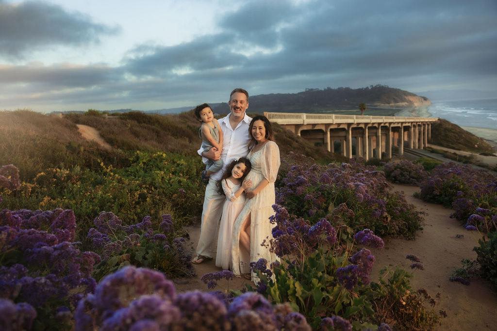
Shoot in soft, directional light (early morning or late afternoon works best)
Good light naturally adds depth and contrast, which allows colors to appear richer with minimal editing later.

Increase Contrast Before Adjusting Saturation
If you want to make colors pop in Lightroom or Photoshop, contrast matters more than saturation.
Contrast separates tones, giving color something to stand on. Without it, increasing saturation often leads to muddy shadows and unnatural skin tones.
Editing workflow for better color:
Adjust contrast, blacks, and whites
Fine-tune highlights and shadows
Use vibrance instead of saturation
Vibrance boosts muted colors while protecting skin tones, making it ideal for portraits, lifestyle photography, and natural light images.
Small adjustments here create big improvements without over-editing.
Use Targeted Color Adjustments for a Professional Look
Rather than boosting every color equally, focus on intentional color control.
In Lightroom, the HSL panel allows you to:
Brighten or darken specific colors
Increase saturation only where needed
Create depth by slightly darkening dominant tones
In Photoshop, a simple Soft Light layer can add contrast and richness. Duplicate your image, set the blend mode to Soft Light, and lower the opacity until the image feels balanced.
These techniques help colors pop while keeping images realistic and polished.

An Editing Tip for Adobe Photoshop
You have your slightly underexposed image, so now what? A good way to make the colors pop is to add some contrast (and maybe a touch of brightness depending on the image).
- Open Image in Photoshop
- Go to your Layers window (You can do this by going to menu, selecting Windows ,and then scroll down to Layers. )
- Double Click on the layer and a Layers Window will open up (below it is shown).
- Duplicate Your Background Layer
- A Dropdown menu will be just above the layers where you will see an option to change “Blend Modes”, Select the “Soft Light” blend mode (and also be sure your Duplicated Layer is selected. This will add a nice amount of contrast and punch to the colors in your photo.
- Adjust the Layer opacity as needed. If the contrast is too much, you can lower it by reducing the opacity number of that duplicated layer.

An Editing Tip for Lightroom
Adjust the Contrast slider on the left side in your editing tools. When I am adjusting the Contrast slider, I usually pair it with the Exposure slider with a slight adjustment. Definitely play with it to get the desired effect.

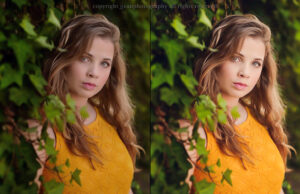
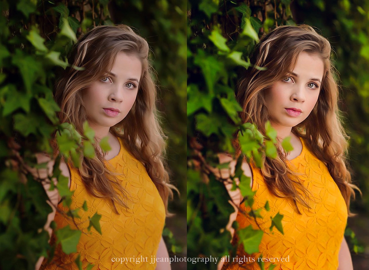
Editing with Actions and Sky Overlays
Applying Actions
There are a range of different photoshop actions out there. These pre-recorded editing steps are customizable to each individual image. Simply just select the action and press “play” and watch the magic happen! I use these to help speed up my time in with editing.
For bold and rich colors, my two favorite collections that I use often are
Both of these sets include video tutorials on how to apply them to your images. Below is an example of processing an image with one of the actions.
I do have resources for presets for Lightroom as well. You can check out the Evolve Collection as it is a favorite and comparable to the Wonder Collection.

Sky and Light Overlays
Overlays are images that can be merged onto an existing image and sometimes adding a sky or light to an image can give it that extra “wow” factor and really make the photo pop.

A couple of favorites that I use are:
You will need Adobe Photoshop when adding a sky to your image.

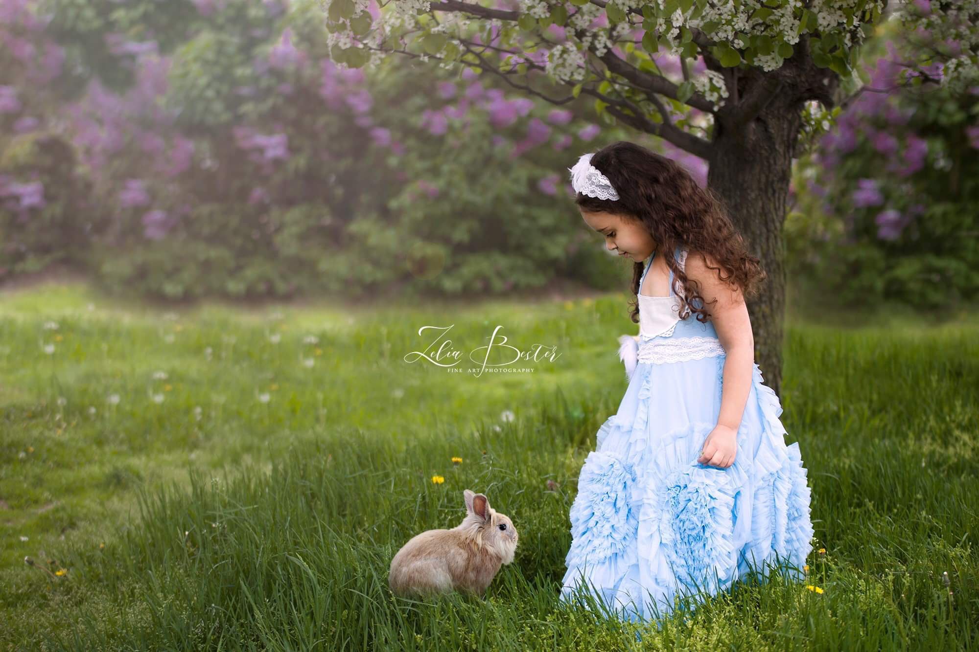
Bonus Tip: Composition Plays a Role in Color Impact
Color doesn’t exist in isolation. Composition affects how vibrant a photo feels.
To enhance color naturally:
Use contrasting backgrounds
Remove distractions that compete with color
Create separation using depth of field
When color has space and intention, it feels stronger without extra editing.
Vibrant Color Comes From Intention, Not Excess
Learning how to enhance color in photography takes practice, but it shouldn’t feel overwhelming. The goal isn’t extreme saturation — it’s clarity, contrast, and control.
As you practice seeing light and color more intentionally, your edits will become simpler and more confident. Over time, you’ll develop a style where your colors feel bold, cohesive, and unmistakably yours.